
I’ve started to re-use R recently for a project that I’ll blog about soon, having only briefly used it before in an academic project. It’s very powerful, and once you know what you’re doing can be used to manipulate data sets quickly. However it is known to have a steep learning curve and I’ve found myself quite frustrated with it at times.
Plotting misery
Here’s a bit of sample code I think gives a good illustration of how quickly you can do something useful.
# Load zoo timeseries library and Quandl financial data library
library(zoo)
library(Quandl)
# Quandl.auth("x") Add quandl authentication key here if you have one

load_misery <- function() {
  # Download the data for UK monthly unemployment and cpi inflation figures.
  # Symbols previously looked up on Quandl
  unemployment <-  Quandl('BCB/3791', type="zoo")
  cpi <-  Quandl('BCB/3798', type="zoo")

  # Calculate year-on-year inflation via rolling window of 13 months data.
  inflation <- rollapplyr(cpi, 13, function(x) 100 * (x[13] - x[1])/x[1])

  # Calculate the "misery" index as the sum of inflation and unemployment
  misery <- unemployment + inflation

  # Find limits of the data
  begin_dt <- max(c(start(unemployment),start(inflation)))
  end_dt <- min(c(end(unemployment),end(inflation)))

  # Combine into a single series and trim to limits
  all <- window(merge(unemployment, inflation, misery), start = begin_dt, end = end_dt)

  return (all)
}
This downloads a couple of time series from the Quandl site, which is an excellent resource for historical financial and economic data. The first is the UK unemployment rate, expressed as a percentage, and the second is the UK consumer price index (CPI). Quandl has a number of sources for these, oddly the best source of free, monthly data comes from the Brazilian Central Bank, hence the codes beginning BCB above.
To get the inflation figure from the CPI you need to find how much it has changed over the previous year, as a percentage. That’s done quite neatly above by the rollapplyr function. I then wanted to calculate the “misery” index, just the simple sum of unemployment and inflation, and this is trivial to do in a single line. Finally I trim the data so that it’s all the same size.
Having done this plotting the results couldn’t be much simpler:
data <- load_misery()
plot(data)
Giving a graph as below.
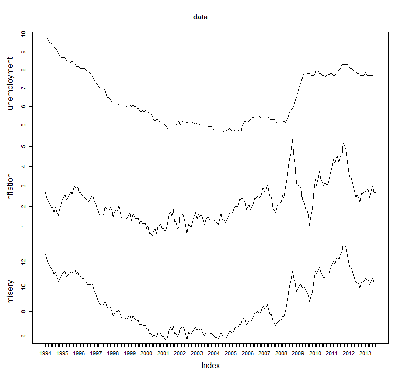
I think it’s impressive how quickly you can use R to generate something like this. The code is compact and the plot looks reasonable without any work. I don’t think I could have achieved a similar result in as short a time in any other language, even Excel.
Enduring misery
Next I thought I’d try to find average figures for the prime-minister in office during the period covered by the data. I achieved this with the code below.
summarise_by_pm <- function(data) {
  pms <- data.frame( pm = c("major", "blair", "brown", "cameron"),
                     start = c(as.Date('1990-11-28'),
                               as.Date('1997-05-02'),
                               as.Date('2007-06-27'),
                               as.Date('2010-05-11')))

  aggregate(data,
            list(sapply(index(data), function(x) pms[findInterval(as.Date(x), pms$start),"pm"])),
            function (x) round(mean(x),1))
}

data <- load_misery()
print (summarise_by_pm(data))
This gives the output:.
        unemployment inflation misery
blair            5.3       1.6    6.9
brown            6.5       2.8    9.3
cameron          7.9       3.4   11.3
major            8.4       2.3   10.7
I’d like to be able to say that this was just as quick, but those two lines of code took me a very long time to get right. The issues I encountered were typical of those that have frustrated me, such as confusion over data types, not being aware of the availability of functions, and somewhat opaque manual pages once I’d found them.
The aggregation function above is like a group-by clause in SQL. Naturally you need to supply the factors to group by, the purpose of the second argument to the function, and this is where I struggled. The findInterval function works as a range lookup, like lower_bound in C++ or a vlookup in excel with range_lookup set true. This was just what I needed to find the relevant row in the pms dataframe given a date, but I laboured for some time with a clumsier implementation before stumbling across it.
The aggregation function takes a list describing the factors to aggregate by. I initially mis-understood that this list should have a factor per row of the data you are aggregating, it’s actually a list of classifications, the classifications having a factor per row. Now I have a better understanding of what a list is in R this makes more sense. Equally I was initially confused as to why the output of the two lines below would exhibit different behaviour:
list('a','b')
list(unlist(list('a','b')))
On the face of it this appears to be un-listing a list, and then re-listing it. In fact in the second line the unlist function converts the list to a vector, then this is converted to a list with a vector being the single element. This is obvious when looking in isolation like this, but was less clear in the middle of more involved code.
The zoo structure, used to store timeseries, looks rather like a dataframe. However the underlying storage of values is as a matrix. Unlike a dataframe a matrix can only hold one datatype, so it is not possible for a zoo series to hold both numerical data, like inflation, and string data like a prime-minister’s name.
Avoiding misery
The final result is pleasingly compact, and hopefully what doesn’t kill me makes me stronger at R. Here are a few disparate tips for anyone starting with it from a coding background.
- Use the RStudio IDE rather than RGui. Adjust your expectations though, it’s not Visual Studio.
- As soon as you start looking at data frames, understand what stringsAsFactors means and realise you will normally want to set it to FALSE.
- If you’re going to be working with timeseries data at all, make immediate use of zoo or xts and spend a bit of time understanding datetime representation. This isn’t complete but provides a good introduction.
- Before thinking of showing any of your code it’s worth reading the style guide.
- The usual process of developing is to get something working in the interactive console then to put this code into a function in your script file. I’ve lost count of the number of times I’ve done this and accidentally referred to variables defined in the global scope (via the console) from within the function. It might seem to work fine at first, but then apparently start using the wrong values.